
Showing live members on your pages
Published Updated
Your pages can show real members from your brand, kept current by the platform rather than by you, and styled to look like the rest of your site. This guide covers how to ask for one, how to choose the place so it shows people who are genuinely there, and what to check before you publish.
What the members widget is
The members widget is an empty block you put on a page. When the platform builds that page, it fills the block with real members from your brand: their photo, first name and age, where they are, a line they wrote themselves, an ID-verified badge where they have one, and a button to your join page.
You are not saving a list of people into the page. You are describing who you want shown, and the platform works out who that is when it builds. Hide or delete a profile and it stops appearing the next time the page is built.
It contains no JavaScript. That matters if you upload your site as a zip: a page carrying custom JavaScript is rejected and does not import at all. The members widget is plain HTML, so it always imports cleanly.
When to use it, and when not
Use the widget any time a page needs to show members: a homepage, a community page, a location page, a band partway down an article.
There are two jobs it cannot do, and for those the toolkit uses saved member data instead:
- Individual member profile pages. Those need their own address, their own page title and description, and their own structured data. The widget produces cards inside a page, not pages.
- Quoted member reviews. A review is a piece of writing with a person attached, marked up so search engines can read it as a review. The widget shows profiles, not testimonials.
If you want members shown and you need neither of those, use the widget.
Anatomy of a card
Every card is built the same way, and knowing which part comes from where saves a lot of guessing later.
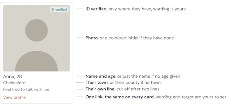
- The photo. Members without one get a coloured circle showing their first initial, so a card is never blank.
- Name and age. A member who has not given an age shows just their name, so this line is not always "Name, 32".
- Where they are. Their town, or their county if they have not given a town. Punctuation is stripped, so King's Lynn shows as Kings Lynn and Stoke-on-Trent as Stoke On Trent.
- Their line. Whatever they wrote about themselves, or their headline if they wrote nothing longer. Some members have neither, and the line is simply left out on those cards, which is worth knowing before you write copy promising "in their own words".
- The ID-verified badge. Shown only for members who have verified their identity. On a real brand this is a minority, so expect most cards not to have one. The wording is yours to set.
- The link. One link per card, going to the same place on every card, which by default is your join page. Both the wording and the destination are yours to set, and the wording section below covers the options.
A join tile is added at the end unless you turn it off, so by default the block shows one more tile than it has members.
Controlling how it looks
The widget decides who is shown. You decide what it looks like. The platform supplies the members and the underlying structure, and the styling is written for your brand, in your colours, type and spacing, like any other section of your site.
So "a grid of cards" is a choice, not a fixed shape. The same block can be a wide feature grid on a location page, a tight row of small thumbnails above a sign-up form, circular photos in a hero band, or a single column on a phone. Ask for the treatment you want in the same breath as the block itself.
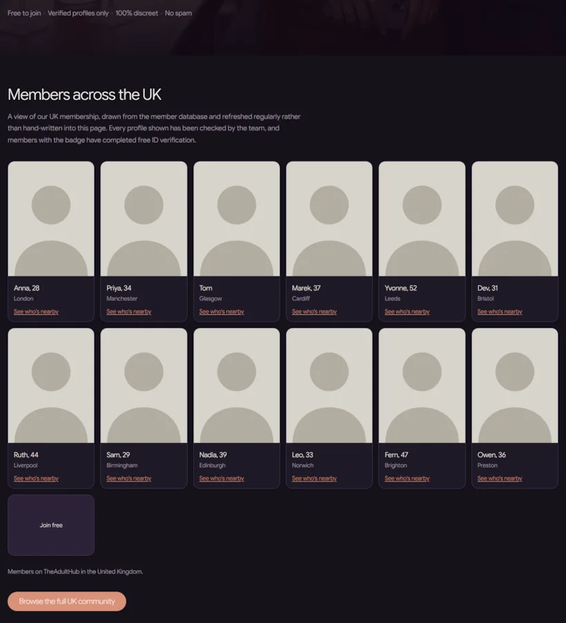
Say what you want it to look like. "Match the article cards further up the page", "two across on a phone", "square photos, no border", "our pink for the link". Anything you would say to a designer works here, and it saves a round of revisions.
There is one styling mode you can end up in by accident, and it is worth knowing the symptom. The platform can supply a plain default appearance instead: light grey and terracotta cards that look nothing like your brand and ignore your dark mode if you have one. If a member block arrives looking generic and your styling does not seem to touch it, that is what has happened. Say so, and ask for the block to be built so the styling is yours.
The wording and links are yours too
Four pieces of text and one link on the block can be set to whatever you want: the link on each card, where that link goes, the label on the join tile, the wording of the ID-verified badge, and the message shown when nobody matches.
Left alone, the card link reads "View profile" and goes to your join page, which is the usual funnel: a visitor signs up, and then browses everyone including the person they clicked. If that is the journey you want, it works as it is. If you would rather set expectations differently, "See who's nearby" or "Join to say hello" both read well, and you can turn the per-card link off entirely and let the join tile carry a single call to action.
Two more things this opens up:
- Brands that are not in English. If your site is in Spanish or Portuguese, set all four strings, or you get a Spanish page with English wording running through the member block.
- Knowing whether the block works. You can point the card link somewhere of your own, including your join page with a tracking parameter on the end, so you can tell how much sign-up traffic the block actually produces. Ask for that if you want the number.
Twelve identical links on one page is also weak for search engines, which is a second reason to turn the per-card link off unless it is doing a job.
Asking Co-Work for one
You do not write the block yourself. You describe what you want and the toolkit writes it.
A weak ask
"Add some members to the homepage."
Nothing here says where, who, or how many. All of that still gets decided, just not by you, and none of it gets shown to you.
A strong ask
"Check how many members we have in Essex first. Then add a members block to the homepage: women and men, 30 to 55, about 12 of them. Style it to match the article cards further down the page. Change the card link to say 'See who's nearby'. Tell me the exact location value you used."
Six things, and each one closes off a way the block can disappoint you: check the market first, say who, say how many, say what it should look like, fix the misleading default label, and ask to see the value that decides whether any of it is about the right place.
What a good answer looks like
Whatever it builds, the reply should tell you four things. If any is missing, ask for it.
- How many members it actually found in the place you asked about. This is the number that should shape the page, and it is knowable before anything is built.
- The exact place value it used, written out in full. For Essex that is
England: Essex, notEssex. The next section explains why that difference matters more than it looks. - Whether it widened, and to what. If you asked for one town and it covered the county instead, the heading on the page has to say so.
- That the block shows nothing on your own computer. Members are added when the platform builds the page, so a local preview shows an empty space. That is correct, not a fault.
Getting the place right
One behaviour makes this the most important section in the guide.
A place name the platform does not recognise is ignored, not rejected. The filter is dropped and the page fills with real members from everywhere. There is no error, and the block does not come back empty. The page looks completely healthy.
Measured on a real brand, asking for members in Essex:
| What was asked for | What came back |
|---|---|
England: Essex | 20 members, every one of them in Essex |
Essex, with the country left off | 20 members, spread across 16 different counties |
| A made-up county name | 20 members, spread across 17 counties |
England: Bolton, which looks like a county but is half of one | 20 members, spread across 15 counties |
Every one of those produced a full, good-looking grid of real people. Three of them are wrong, and nothing on the page says so. That is why the rules below are worth following exactly rather than approximately.
The rules
- UK counties carry their country in front.
England: Essex,Scotland: Glasgow,Wales: Bridgend, Mid Glamorgan,N.ireland: Antrim. Only the UK works this way.California,OntarioandDublinare written plain. - Always give the county alongside the town. Town names repeat: Leeds is a town in both West Yorkshire and Kent. Asked for Leeds with no county, the platform returned 20 members, all in West Yorkshire. Asked for Leeds in Kent, it returned the 2 who are actually there.
- You can name several places at once, for countries, counties or towns, and the block fills up from each in turn. That is how you cover a city and its neighbours, or two counties, in one block. See the widening section below for when that is the right move.
- Member types are exact too. Asking for "women" rather than the value the platform uses drops the filter and returns everybody. So does mixing "all" into a list of types.
- Thirty-three county names contain a comma inside the name itself.
England: Bolton, Greater Manchesteris one county, not two. Ten Greater Manchester boroughs and twenty-two of the twenty-four Welsh counties are named this way, plus one in the United States.
Those comma-containing names are the sharpest edge here. If one of those names is split at its comma, it becomes two half-names, and neither half is a real place. Measured on a real brand: England: Bolton, Greater Manchester asked for correctly returned 9 members, all of them in that county. Its two halves asked for separately returned 20 members spread across 15 and 17 counties respectively. So the failure does not look like a failure, it looks like a busy page.
You do not have to handle this yourself, but you do have to check it. If your county name has a comma in it, ask Co-Work to confirm it is being sent as a single county, and look at the towns on the finished page.
The habit that protects you. Always set the county. A mistyped town then widens the page to that county, which is survivable. A mistyped town with no county widens it to the entire country, which is not.
Check a place name
Type a county or town and this gives you back the exact value the platform recognises, tells you when a town sits in more than one county, and shows you the towns a county covers.
You do not need this to build. Co-Work confirms every place value itself when it builds a page. This checker is for you: for choosing which places deserve pages, for satisfying yourself that a live page is targeting what you think it is, or simply for browsing what is available. It reads the platform's published location lists and never touches member data.
How it stays current
Keeping the block current is handled for you. Members are resolved when the platform builds the page, and pages carrying a member block are rebuilt by the platform on a regular cycle, so new members appear and people who have moved on drop away without anyone touching the page.
Publishing the page also refreshes it immediately, so any edit you make brings the members up to date at the same time.
Thin towns, and widening honestly
Ask for the numbers before the page gets built. Co-Work can count how many members your brand actually has in a place, for a county or for a list of towns, before a single line of the page is written. Say "check how many members we have in Essex, and in Chelmsford, Colchester and Basildon". You get real counts back, and the page gets designed around what is there instead of around a guess.
It answers a question you cannot otherwise tell apart: whether a place is thin, or whether your brand has no members in that country at all. Those look identical on a finished page and need completely different responses.
Most towns have far fewer members than you would expect, even on a busy brand. Measured on one real brand, in a single English county:
| Asked for | Members returned |
|---|---|
| The whole county | Filled the block immediately |
| Colchester | 15 |
| Chelmsford | 4 |
| Basildon | 4 |
| Southend-on-Sea | 3 |
| Harlow | 2 |
One town in that county can carry a page on its own. The rest cannot, and this is a brand with plenty of members.
A rule of thumb that serves well here. County pages are the reliable default: the pool is deepest and the wording survives whatever comes back. Where you want a town page and the town is thin, naming two to four nearby towns, closest first, lets the block fill up from each in turn, and a heading like "in and around Chelmsford" keeps the page straight with what it shows. Town pages of their own are best kept for towns that can fill a block single-handed.
Match the heading to what was actually asked for. If the block draws on three towns, "Members in and around Chelmsford" carries it, where naming the single town does not. It is a small wording call that keeps the page straight with the visitor.
Location landing pages
The widget's biggest use is a page per place: "meet people in Essex", one for each county that matters to you. The toolkit can build these for you, and it can build a set of them.
What makes one worth having
- Real writing about the place. Two or three sentences that could only have been written about that county: distances, how people actually travel there, what the area is like. If the text would read identically with another place name dropped in, search engines treat the page as filler, and so do readers. This is the one part the toolkit genuinely cannot invent for you.
- Counties first. Build the county pages, then add town pages only for the towns that earn one.
- Links between them. A set of location pages that link to each other and to a parent list is a section of your site. A pile of unlinked pages is not.
On volume. One English county alone lists over 300 towns, and most of them will have no members. A large set of thin pages tends to dilute the ones that are working rather than add to them, so the counts are worth having in front of you before you decide how many to build. Co-Work will flag it if a requested set looks like it would land that way, which is a prompt to check rather than a refusal.
A worked example: a UK members section
A real build, shortened to the three exchanges that mattered. A brand wanted to show its UK members, and it ended up as a hub page plus one page per major city.
One: decide the shape before building
I want to show our UK members. A page for the UK, then a page for each of the biggest cities. Check what we've actually got before you build anything.
Checked the inventory first. UK-wide fills a twelve-card grid easily, so the hub page is safe.
Per city, this is what is actually there:
- Deep enough for a full grid: London 50+, Manchester 50+, Liverpool 39, Glasgow 34, Birmingham 31, Leeds 31, Bristol 29.
- Too thin to carry a page: Newcastle 10, Coventry 10, Portsmouth 9, Sheffield 8, Aberdeen 8, Belfast 7.
So: a hub at /members/uk, and seven city pages at /members/uk/london and so on. I would leave the thin ones out for now, and they can be added later once the numbers move.
The structure was settled before a single page existed, and the member counts decided it. That is the whole trick: measure first, then design.
Two: the build
Go with those seven. Match the styling to our London page.
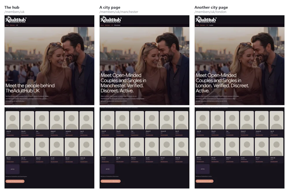
Eight pages built. The hub targets the country and nothing narrower, so its heading reads "Members across the UK" and stays true whatever comes back. Each city page targets its own city.
Styled from your own tokens, so the grid picks up your dark palette, card shape and link colour rather than arriving with a look of its own. Built from one template, so adding Southampton or Cardiff later is one record and one command.
Two things I deliberately did not write: no "updated daily" or "online now" claims, and no invented member counts. The stat pills reuse the real figures already on your UK landing.
Expect the grid to be empty when you open the files on your own machine. The platform fills it when it builds the page.
Three: the last check
Anything I should know before I publish?
- Every block is set to your own members only.
- Every place value was confirmed against the location reference, so no page is quietly showing members from somewhere else.
- Once live, the pages refresh on their own. The platform takes care of it.
Worth asking every time before a publish. It is one line, and it catches whatever is left.
What it added up to
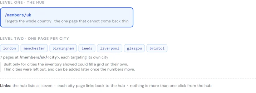
- The hub at
/members/uk, targeting the country and nothing narrower. It is the page that can never come back thin, and the parent the rest hang from. - Seven city pages at
/members/uk/<city>, one per city, and only for the cities that could fill a grid on their own.
The hub lists all seven, and each city page links back to it. Two levels is enough: it keeps every address short, and there is no page more than one click from the hub.
Prompts you could use instead
The same build, asked for differently.
"Check how many members we have in each of the ten biggest UK cities and show me the counts. Then we'll decide which ones get a page."
"Build just the Manchester page first so I can see the treatment. If I like it, do the rest from the same template."
"Same again for our Spanish brand, and the card link, the join tile, the verified badge and the empty message all need to be in Spanish."
Before you publish
Seven checks. None takes more than a minute, and the first two matter most.
- Confirm the place value. Ask Co-Work to tell you the exact value it used, then paste it into the checker above. If it does not come back as a match, the page will show the wrong people.
- Confirm the county is set as well as the town, and that any comma in a county name survived intact. If the block names a town, it must also name a county.
- Ask for the member counts if you have not already. A page built for a place with four members in it needs different copy from one with two hundred.
- Read the heading against the query. If the block was widened to neighbouring towns or to the whole county, the heading must not name a single town.
- Ask whether it is showing only your own members. Measured on a real brand, turning that off changed nineteen of the twenty people in the block to members of other brands, and the page looked entirely normal. It should be on. Worth asking outright on any page built a while ago.
- Read the link on the cards and decide whether the default wording is the one you want. It is a deliberate choice, not a leftover.
- Check the page still reads correctly with the block empty. Ask what the page looks like if the query returns nobody. If the answer is "there would be nothing there", the page needs a fallback message.
After publishing, look at the page. Read the towns printed under three or four of the faces. If the heading names one county and the cards name somewhere else, the place value was not recognised. That is the entire failure mode, and it is visible in ten seconds if you look for it.
One thing to expect: a local preview shows an empty block. The members are added by the platform when it builds the page, so a file opened on your own machine shows a space where the grid will be. Publish, and the platform fills it and keeps it current from there.
If something looks wrong
The members are from the wrong places
Almost always a place value the platform did not recognise, so the filter was dropped. Check the value in the checker above. The usual causes are a missing country in front of a UK county, two counties written as one value, or a town given without its county.
The block is empty on my computer
Expected. Members are added when the platform builds the page. Publish it and look at the published page.
The block is empty on the published page
Usually the query matched nobody: a town that is genuinely thin, combined with a narrow age range or a single member type. Widen to the county and change the heading to match.
If you are confident there are members in that place, flag it rather than editing the page again. An empty block is also what you get when the page cannot identify your brand to the member service, and that is a platform-side fault you cannot fix from the page.
None of these people look like my members
The block is probably not restricted to your own brand. See check 4 above. This one is worth ruling out first, because the page looks completely healthy either way.
It looks generic, and nothing I ask for changes it
The block has probably been built in the platform's default appearance, which carries its own styling. Ask for it to be rebuilt with the styling in your hands, and see "Controlling how it looks" above.
The same people have been on the page for a long time
Republish the page, which refreshes it straight away. If it settles again after that, mention it so the block can be looked at.
It is showing fewer members than I asked for
Normal. The number you give is a maximum, not a target: the block shows whoever it found, and in a smaller place that is far fewer. A ragged last row is what a real result looks like. If it is showing far fewer than the counts you were given for that place, say so.
The wording on the block is in English and my site is not
The text on the cards, the join tile, the badge and the no-results message can all be set. Ask for them in your language.